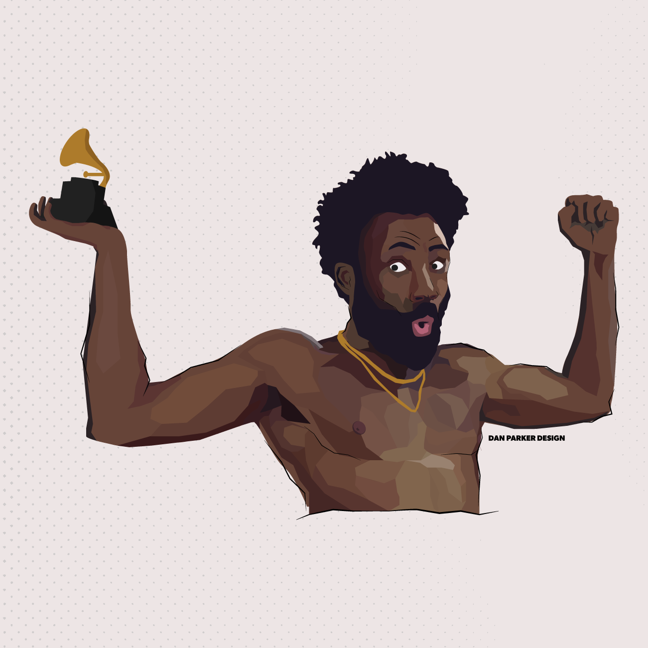
Childish Gambino Illustration Study
Over the last few months or so i have invested a lot of time in finding and refining a more unique style of illustration. With this illustration of comedian/musician/actor donald glover AKA Childish gambino I feel as if i have taken a step further in achieving a this personal style. in this brief study i will go through the few broad steps that were taken from the first reference image to the final product.

#1 - REFERENCE IMAGE
Choosing a good reference image with portrait-type illustrations is very important when working to capture an accurate likeness and to be able choose areas that can be tweaked stylistically. With the overall message of the illustration to bring together Childish Gambino and his recent Grammy win, I thought it ideal to work on my own take of one of the more recognisable shots from the ‘This is America’ music video.

#2 - BASE COLOURS
To start simple is key, and having an outline of what I want to achieve is very helpful as I progress further. These illustrations can take some time and having an extremely basic outline of what you want to end up with can be very beneficial. In this case I have used my base colours layer to correctly judge the proportions of the body and incorporate the Grammy award into the design.

#3 - LINEWORK
Linework is where details become into play and can be great for outlining the figure’s most defining areas. Looking back at the reference image I decided to accentuate the face of Glover as much as possible in order to really build on the Portrait’s likeness. In the case of this Illustration, I use linework in a more stylised way where the lines don’t religiously follow the blocks of colour and instead overlap into different shapes and areas whilst loosely maintaining the correct sense of direction.

#4 - DETAILS & DEPTH
This is where the previous planning and structure can really come into fruition. This step is all about mounting shape after shape and using many levels of colour to create a sense of depth and realism to the portrait. To be more suited with the harsh points of the linework I decided to withhold any curved shapes in this process and opt for much harsher points throughout. This is by far the lengthiest step and the more time taken, the more realistic the portrait will end up, It is important to look for feedback and settle at a point where your end product can still be recognised stylistically.

#5 - FINAL TOUCHES
The final step in this case was to combine the previous layers together and prepare the image for upload across social media. At the moment my Instagram page is maintaining a theme across all posts with this slightly off-white background colour in order to maintain consistency across all posts.
Upon combining all the previous steps there will inevitably be a small round of tweaking where small pockets of colour are covered but these small problems are easily fixed.