
Music to Design Review : Little Simz - GREY Area
From the first track, Little Simz delivers honesty with confidence and skill in this year’s best hip-hop LP so far.
Let’s start out with a little explanation. Welcome to the beginning of a series combining both new music and design where I’ll recommend some of the best new albums whilst creating an alternate piece of artwork and talking about how the music has influenced my approach. now, lets get going.
From the first track, Little Simz delivers honesty with confidence and skill in this year’s best hip-hop LP so far.
Generally underrated for quite sometime now, Little Simz has come out with her most enjoyable record yet and is showing the world that her co-sign from Kendrick really is no joke. After all, if you’re backed by the likes of Kendrick Lamar, Lauryn Hill and Gorillaz then surely you’re doing something right. On songs such as ‘Backseat’ from her 2016 album ‘Stillness in Wonderland’ Simbi dwells on the idea that she has lived life in the backseat and that in reality, this is the life she has chosen, as a woman in rap it is that much harder to reach mainstream success, and hip-hop as a genre has always catered to men over women in regards to popularity. This leaves Little Simz in the grey area where she has to show that extra level quality in order to get into the driver’s seat. Where her 2016 album had the showings of her capability it sometimes struggled from being quite difficult to digest in its entirety as a layered concept album. Grey Area however, is full of sharp flows and nice hooks whilst maintaining that same level of lyrical prowess.
Despite moving away from being a complete ‘concept’ album ‘Grey Area’ delves deeper into the more personal side of her life and her songwriting shines in turn. Songs like ‘Sherbet Sunset’ deliver sincere insights into a failed relationship and her thought process following it. The song is introspective throughout and the instrumental is a perfect backdrop for Simz to ride with an assortment of flows, before circling back to the almost angelic chorus directly addressing her ex-lover. On the flipside, tracks such as ‘Venom’ sees Little Simz in her most lethal skin. Rising, disjointed strings build to a drop that sees her attack people’s preconceptions of her whilst questioning the problems she faces with her own psyche. Along the way she tackles her problem with being categorised as a female MC, the bar “Never givin' credit where it's due 'cause you don't like pussy in power” showing her issue with being looked over by many purely based on gender alone.
The album as a whole fails to hit a flat note as it progresses with cuts such as ‘101 FM’, a trip down memory lane for Simz, and ‘Selfish’, the lead single for the project being among other tracks which stood out to me. Changes in tone and production help maintain a high level of variety throughout whilst Little Simz herself delivers a consistently high level of clever and quick flows. Features from Chronixx, Little Dragon and Michael Kiwanuka all do well in elevating their respective tracks, Chronixx standing out the most throughout ‘Wounds’ with strong vocals very much suited to the emotional tone and sound of the song.
‘Grey Area’ has firmly laid its mark as what could very well be the year’s best hip-hop LP so far. Little Simz delivers a great album that fails to put the brakes on and continues to push Simz talents a step further than previously achieved. Some of her best flows and most personal, introspective lyricism is on show here alongside a great variation of production that compliments Simz wonderfully. With hard hitting tracks such as ‘Venom’ and softer cuts like the album’s closing song ‘Flowers’ a great presentation is provided of someone who can now safely be considered one of the UK’s best rappers.
Design Overview:
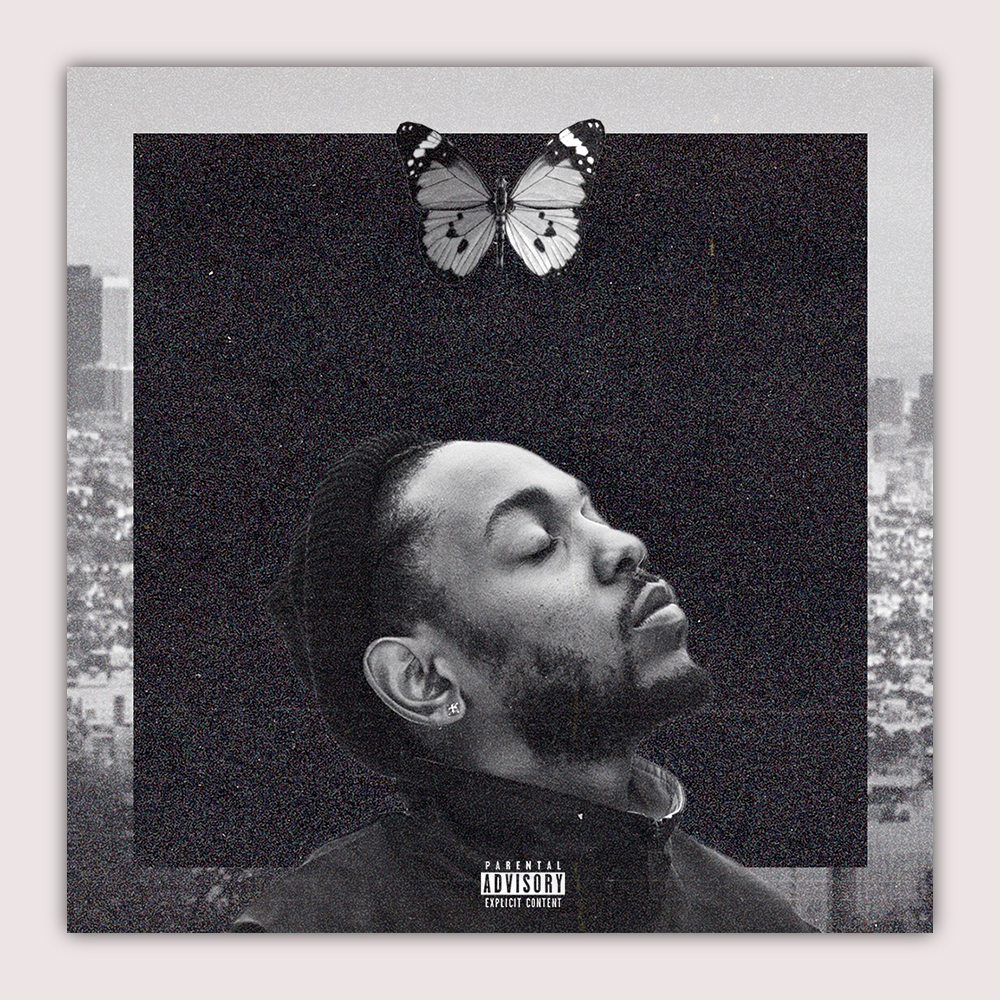
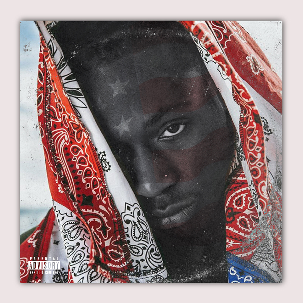
Much of the lyricism on show here very much inspires a visual representation of the album alone. In fact, Little Simz has ventured out into experimentations with photography with this album too, with an exhibition of photography inspired by her album recently being shown in Los Angeles. With my album cover design I chose to try and explore the more introspective nature of the album whilst tackling the name of the LP, ‘Grey Area’ itself. With this I started by experimenting with ways monotone printers marks could be incorporated into the design and was very soon inspired to follow suit with the way in which it is included on the cover of Frank Ocean’s ‘Endless’ album. However, differently here, I chose feature a much clear inclusion of type, with the name and title cutting from the edges of the cover. I found the selected photograph to be a great visual of the artist that worked well and suited a lot of the themes found on the LP, the covering of her face alluding to the personal struggles that come to light. The curved line elements act as a contrast to the harsh corners and shapes on the cover and help tie the composition together, resulting in a tighter, more complete final product.

Alternate Artwork Design - Little Simz, GREY AREA
FOR MORE WORK LIKE THIS PLEASE CLICK HERE AND BE SURE TO CHECK OUT OTHER SOCIAL PAGES.

Childish Gambino Illustration Study
Over the last few months or so I have invested a lot of time in finding and refining a more unique style of illustration. With this illustration of comedian/musician/actor donald glover aka childish gambino I feel as if I have taken a step further in achieving a this personal style. In this brief study I will go through the few broad steps that were taken from the first reference image to the final product.
Over the last few months or so i have invested a lot of time in finding and refining a more unique style of illustration. With this illustration of comedian/musician/actor donald glover AKA Childish gambino I feel as if i have taken a step further in achieving a this personal style. in this brief study i will go through the few broad steps that were taken from the first reference image to the final product.

#1 - REFERENCE IMAGE
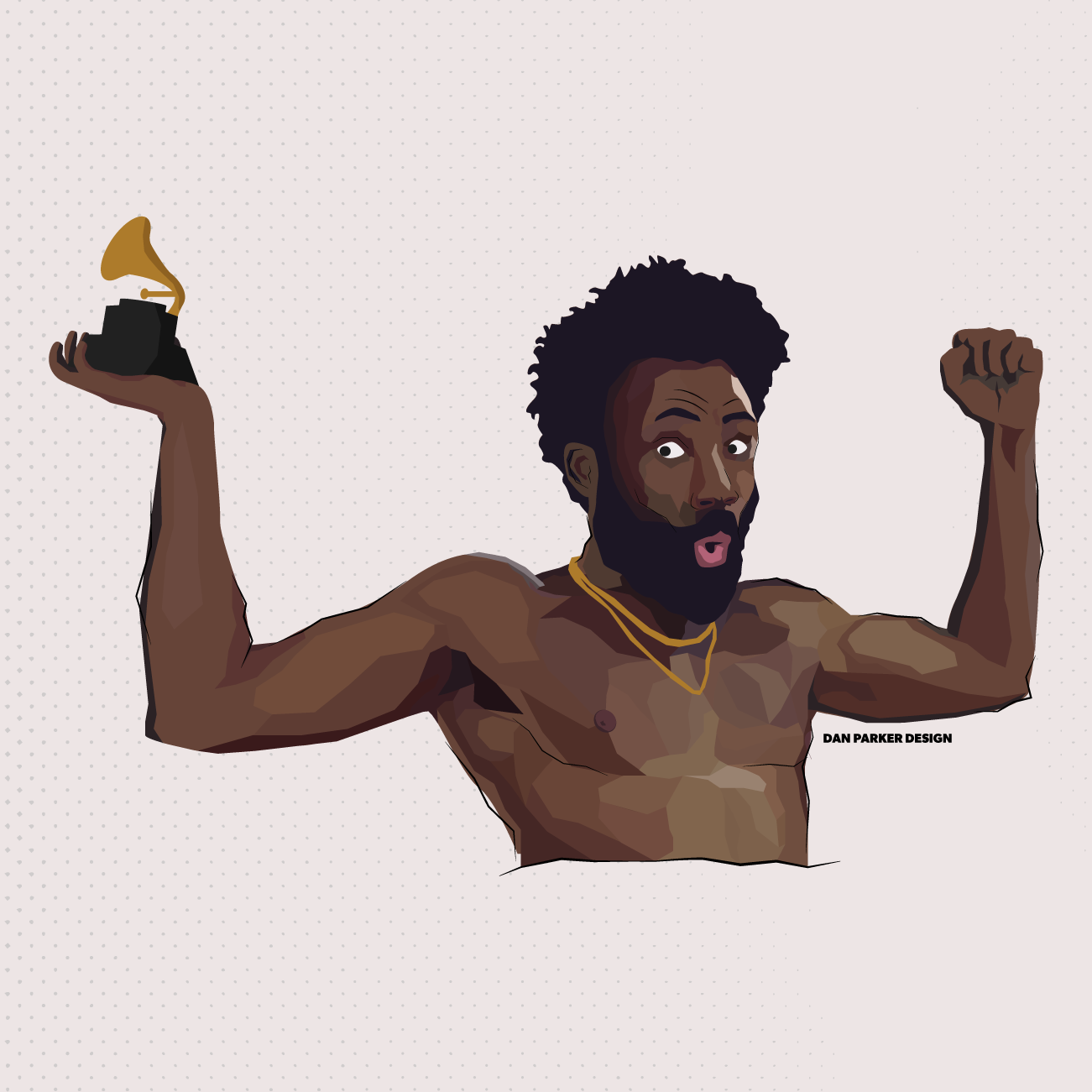
Choosing a good reference image with portrait-type illustrations is very important when working to capture an accurate likeness and to be able choose areas that can be tweaked stylistically. With the overall message of the illustration to bring together Childish Gambino and his recent Grammy win, I thought it ideal to work on my own take of one of the more recognisable shots from the ‘This is America’ music video.

#2 - BASE COLOURS
To start simple is key, and having an outline of what I want to achieve is very helpful as I progress further. These illustrations can take some time and having an extremely basic outline of what you want to end up with can be very beneficial. In this case I have used my base colours layer to correctly judge the proportions of the body and incorporate the Grammy award into the design.

#3 - LINEWORK
Linework is where details become into play and can be great for outlining the figure’s most defining areas. Looking back at the reference image I decided to accentuate the face of Glover as much as possible in order to really build on the Portrait’s likeness. In the case of this Illustration, I use linework in a more stylised way where the lines don’t religiously follow the blocks of colour and instead overlap into different shapes and areas whilst loosely maintaining the correct sense of direction.

#4 - DETAILS & DEPTH
This is where the previous planning and structure can really come into fruition. This step is all about mounting shape after shape and using many levels of colour to create a sense of depth and realism to the portrait. To be more suited with the harsh points of the linework I decided to withhold any curved shapes in this process and opt for much harsher points throughout. This is by far the lengthiest step and the more time taken, the more realistic the portrait will end up, It is important to look for feedback and settle at a point where your end product can still be recognised stylistically.

#5 - FINAL TOUCHES
The final step in this case was to combine the previous layers together and prepare the image for upload across social media. At the moment my Instagram page is maintaining a theme across all posts with this slightly off-white background colour in order to maintain consistency across all posts.
Upon combining all the previous steps there will inevitably be a small round of tweaking where small pockets of colour are covered but these small problems are easily fixed.

What I’m Working On - 11/02/19
A month in to the year I have found myself looking for different ways to improve and new projects to work more with the content I enjoy. The first project i have begun to work on is the production of alternate artwork for various albums and songs.
A MONTH IN TO THE YEAR I HAVE FOUND MYSELF LOOKING FOR DIFFERENT WAYS TO IMPROVE AND NEW PROJECTS TO WORK MORE WITH THE CONTENT I ENJOY. THE FIRST PROJECT I HAVE BEGUN TO WORK ON IS THE PRODUCTION OF ALTERNATE ARTWORK FOR VARIOUS ALBUMS AND SONGS.
Album Artwork
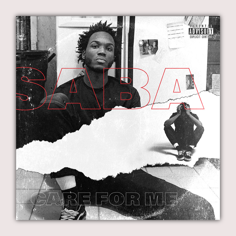
With each new album cover the intention is to experiment with new techniques and provide a twist on the existing identities present with each album and their artist. For example with the first entry to the collection I chose Saba’s album ‘Care For Me’ and used a couple images that accompanied the artist’s album release whilst sticking with a colour theme similar to the original. I then incorporated outlined text and added a select bit of colour to accentuate key parts of the design. I was interested in experimenting with artificial tears in Photoshop and believed this suited the aesthetic of what I was working with here.
After working on a self-set task such as this, I felt that I could be suited to working on more similar little projects and this is where a broader series has formed. Working from music and albums from artists I enjoy I have been creating more and more new alternate LP designs. At the moment I am remaining rather laidback in regards to the output of these but it would be nice to produce at least one or two every week, especially to be in line with any new album releases as well.

Poster a Day Spotlight - #16 Jay Rock, The Bloodiest.
This is the first of my ‘spotlight’ series focusing on one particular poster from my collection of ‘Poster a Day’ designs.


Jay Rock - Redemption // Reference Image
This is the first of my ‘spotlight’ series focusing on one particular poster from my collection of ‘Poster a Day’ designs.
Having listened to Jay Rock’s newest album ‘Redemption’ a lot over the last few weeks I wanted to incorporate him into some form of poster illustration. Looking across the track-list the album I was interested by the opening track, ‘The bloodiest’ and the imagery that could come from this. I began looking at the visuals that Rock himself has already produced to accompany the various songs on the album, all are very stylish and dark, using subtle effects to create a contrast between the environments on display and the message Rock is presenting with the music itself.
From this, I wanted this contrast to be the key focus of the poster and started to explore different ways in which I could present this purely visually. I chose to look at contrast in colour and, inspired by the title of the opening track, I wanted blood to be the focal point of this contrast. I chose to illustrate the poster as opposed to the previous use of only photos in other iterations of the series so far. Due to time constraints this is usually the case but here I opted for a much simpler style of illustration based around mostly line work using a rough brush that was intended to compliment the dusty texture used on the poster. The colours on the illustration are most in dark, block colours with very subtle shadows and highlights.
I chose to look at contrast in colour and, inspired by the title of the opening track, I wanted blood to be the focal point of this contrast.
The body position and pose on the poster is largely inspired by Rock on the cover of the album however I felt using darker colours would be amplify the contrast i wanted and therefore I had him wearing much darker clothes. Having Rock stand in a puddle of blood is not only a strong image, it allows this large red block of colour to dominate the centre of the poster, being the only colour in a sea of monotone. I enjoyed experimenting with this less detailed style of illustration and felt it did not necessarily sacrifice anything in comparison to the more realistic portraits that I have worked on in the past. This is reflected well on social media with this poster proving more popular than other illustration based posts I have experimented with in the past.

Poster a Day - Week #1
Over the last week I have challenged myself to produce one new poster everyday to encourage productivity, new ideas and to boost a more consistent online presence.
Over the last week I have challenged myself to produce one new poster everyday to encourage productivity, new ideas and to boost a more consistent online presence. Each poster is relevant to either my mindset on the day, or to techniques and styles that I have wanted to experiment with in the past. For my first day the most care was taken as I planned to establish an identity of sorts that would be visible and consistent across all of the posters going forward. After some deliberation i settled on a very clean, minimal template that enabled as much space as possible on each poster for the artwork itself to be as free as possible.
“Each poster is relevant to either my mindset on the day, or to techniques and styles that I have wanted to experiment with in the past.”
For my first day I decided to base the poster around musician ‘Frank Ocean’, I began by searching through the internet for different effects and layouts that I’m not necessarily accustomed to. After some time I decided I wanted to take assets from illustrator and merge them alongside photography, so naturally my next stop was to find photography that I believed could work with what I wanted to do. The general photo I was looking for would be very clear, centered on Ocean himself and for Ocean to be positioned somewhat dynamically so any patterns or assets could react to the image itself. I found a photo that fit into everything I had planned and then hopped on to illustrator to create repeating lines which were then placed into Photoshop and warped. The warped line pattern is very representative of the mellow, soulful tones that from Ocean’s music. The pattern is also accentuating the singer’s place on the poster making him seem separate from the background and placing him in the forefront. I made sure the photo is mostly monotone in colour and adjusted Ocean himself to make his skin tone jump out from the darker background. The poster mixes photography with patterns and puts a focus on Ocean’s emotion when performing.
“The warped line pattern is very representative of the mellow, soulful tones that from Ocean’s music.”
#2 - Brockhampton (Iridescence Album Poster)
For the second day I chose to base it around self-proclaimed best boy band in the world, ‘Brockhampton’. The day marked the release of their newest album ‘iridescence’ and so I wanted to create something that accurately captured both the energy and look of their new record. The large colour elements sprawled across the page is a clear nod to the album art and overall theme of Brockhampton’s new album which has a strong focus of vibrant thermal imaging. In order to make these bright colours as effective as possible I implemented a very dark desaturated background, I feel this was especially effective for the final outcome. The photograph features one of the band’s main members ‘Kevin Abstract’. The photograph is somewhere I wanted to push more on the energetic side of the piece, I tried some other variations of this such as repeating the photograph and experimenting with duo tones but settled on a more muted motion blur that spreads across the page. This idea of movement and motion carries over to the repetition of the title on the poster.
“I wanted to create something that accurately captured both the energy and look of their new record.”
#3 - Anthony Joshua Fight Night Poster
Day Three took place on the date of Anthony Joshua’s title defence against Russian, Andriy Povetkin. For this poster I knew I wanted to combine elements seen in the previous two designs, more specifically the motion in day 2’s poster and the prominent focused figure from the first day. I believe I merged these elements quite well with the strong motion blur seen spreading across the page alongside the warped line pattern. The pattern seen is warped to accentuate the movement Joshua is exhibiting in the photograph itself and helping push the impression of power coming from the World Champion.
“The pattern seen is warped to accentuate the movement Joshua is exhibiting”
#4 - Whale Drifting
Day 4 presented the time for newer research to find different styles and techniques that appealed to me. One element I had tried before with text was to create the effect of 3D shapes whilst merging hundreds of individual shapes with dynamic gradients. This has always been a technique I have wanted to push further and therefore I took a focus on how this could be implemented. After more extended research I decided I wanted to take these 3D elements and place them into environments that would result in a surreal outcome. For this poster I chose an underwater setting with a large whale moving through the centre. The large winding shapes climbing from the bottom creates this surreal aspect to the piece and a large sense of this is due to colour correction. The Hue and Saturation was altered to create a blue overtone that brought that made these shapes feel genuinely a part of the setting. The whale itself cuts through the two shapes creating a dynamic effect that makes the animal almost seem 3D.
“The large winding shapes climbing from the bottom creates this surreal aspect”
#5 - Betta
Day 5 saw me return to the drawing board for some more extending research into what really jumped out to me online. During my research I came across a livestream being run by Adobe Creative Cloud featuring designer ‘Temi Coker’ (https://www.youtube.com/watch?v=GIpc0Bggaeg&t=616s) I quickly became interested in his style of design and the fact that he himself had created an established poster a day series. One particular approach he took was using photographs of betta fishes and imposing them onto different models. To achieve this theme I searched through Adobe stock for the relevant fish and model images and got to work. Colour correction is very important with this time of photo editing and manipulation and lets the transition from photo to photo seem much more natural. I like the surreal tone to this style of poster and how it can be presented in a normal, more realistic way.
“it can be presented in a normal, more realistic way.”
The 6th Poster in this series saw me push on the style seen on day 4. The idea going into this design was to take the previous use of this style and create some much more colourful and to interact more clearly with other elements. Using the same blend technique, hundreds of individual circles join together to form the impression of what looks like a 3D shape. In the search for key images I looked for an element in each image in which these shapes could jump from and interact with. As seen in the poster, I decided to have this element be a pair of rounded sunglasses. Not only did this allow me to have another element interact with, it acted as the inspiration for the yellow to orange colour theme. The idea being to have, what looked like beams of sunlight reflecting from the glasses in a very literal way. I added more depth to this poster in comparison to the previous iteration of this style be manually adding a drop shadow in the different areas where the shapes overlap, this provides a much more complete look and makes these shapes seem more like they are interactive objects.
“The idea being to have, what looked like beams of sunlight reflecting from the glasses in a very literal way.”
#6 Lenses
For the final poster of this first set, I continued with the style seen the day before and began to look at different ways in which I can which the winding shapes can interact with a central figure in a dynamic way. I was drawn back to an image i’d seen earlier of rap artist ‘Duckwrth’ who was holding his hands up to the camera creating a very clear foreground/background. I decided to use this image as a way to have the shapes perform as if they are a 3D object moving between the foreground and background. The shape moves in front of hands and wraps round behind them, doing this manages to further separate the fore/background and really push on this illusion of three dimensions. As well as this zooming in on the photograph (previously a full body wider shot) really draws focus onto Duckwrth himself and makes his face the complete central focus of the poster. Differently to previous posters I felt the text sat more comfortably set vertically down the right side of the page whilst still keeping along the grid lines set in the set poster layout.
“I decided to use this image as a way to have the shapes perform as if they are a 3D object moving between the foreground and background.”
#7 Duckwrth
Looking back on this first set of posters I am happy with the variety and exploration into different effects and styles that I would perhaps not have tried otherwise. More practice on these kind of styles and effects is always welcome and can be applied in many different places across a variety of projects. It is good to be able to have a new task to work with each day despite it being difficult to fit in among what can be a busy day to day schedule however I find that a project such as this can help boost both productivity and creativity in the long term. As well as this, after just one set of posts my social media has began to begin growing after being left to the side for quite sometime and I expect this to continue the more consistently work is uploaded.